
|
|
#1
 04-18-2011, 12:52 PM
|
|||
|
|||
|
I am looking for suggestions for contrasting binding for a zebrawood J45 project!
The zebrawood is very light and beautifully stripped with a creamy swiss spruce top. The striping is at least 4 shades of darker brown - from caramel to chocolate. I don't want to go too dark but I want something that will set off the edges and to be honest, I'm just stuck. All opinions welcome!! 
|
|
#3
04-18-2011, 01:43 PM
|
|||
|
|||
|
The fretboard and bridge are rosewood.
|
|
#4
04-18-2011, 01:44 PM
|
|||
|
|||
|
I will probaby match headstock with the binding if it pops!
|
|
#5
04-18-2011, 01:54 PM
|
|||
|
|||
|
Wenge would look nice, but it is pretty dark.
|
|
#6
04-18-2011, 01:54 PM
|
|||
|
|||
|
First thing that came to mind was ziricote, especially if you can find some strips with stripes in them to sort of play along with the zebrawood. But maybe too dark for what you're after.
Curly koa goes with just about everything. Maybe with rosewood side and back purflings to give it a little more border? But it does depend on what other woods you're using. If it was me, I'd run with the light color theme and do curly maple neck, with the koa binding and rosewood side purfling (with binding on fingerboard/headstock as well). Maybe Indian rosewood bridge and fingerboard. Dark and contrasting, but not a pure black & white theme. Or perhaps Honduran rosewood, for even less dark. Headplate, probably match to something else on the guitar. Either fingerboard/bridge, back/sides, or maybe spalted maple with matching rosette. I love wood planning 
|
|
#7
04-18-2011, 02:08 PM
|
|||
|
|||
|
A zebrawood / Redwood OM that I owned had Cocobolo binding and I thought it complimented the zebrawood really well.
The flash in the 1st photo makes the binding look more red than it really was. 2nd photo in natural light. 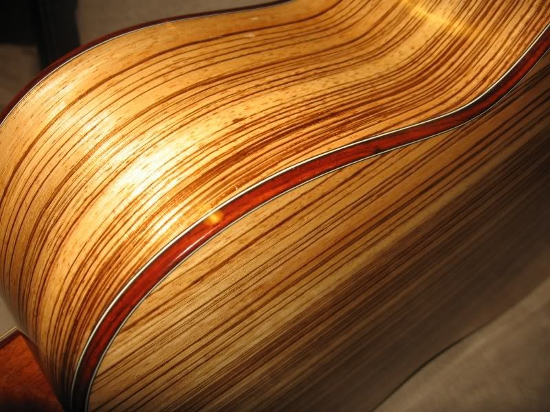 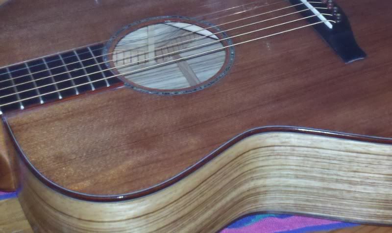
Last edited by downtime; 04-18-2011 at 02:17 PM.
|
|
#8
04-18-2011, 02:19 PM
|
|||
|
|||
|
__________________
Sakazo Nakade Flamenco 1964 Bourgeois D Adi Tasmanian Blackwood 2011 Tom Anderson Strat 1990s Schecter California Classic Strat 1990s
|
|
#9
04-18-2011, 02:44 PM
|
||||
|
||||
|
Maple with BWB
Sorry, I like flow interuption, not contrast.
|
|
#10
04-18-2011, 09:49 PM
|
|||
|
|||
|
The cocobolo looks great!
|
|
#11
04-19-2011, 09:04 AM
|
|||
|
|||
|
Quote:
Jim McCarthy
|
|
#12
04-20-2011, 03:39 PM
|
|||
|
|||
|
I've got some black walnut........hummmm......that may look nice!
|
|
#13
04-20-2011, 06:26 PM
|
|||
|
|||
|
Quote:
Get Peruvian. It looks great. Jim McCarthy
|
|
#14
04-21-2011, 12:27 PM
|
|||
|
|||
|
thanks Jim.........that is very good advice. I think I'm going to try to match the darketst line in the zebrawood for the binding and the peruvian walnut looks very close so I've got some coming.
Now if I could only figure out if some thin red wood red would look good inside of the binding!
|


