
|
|
#1
 08-23-2014, 11:34 AM
|
|||
|
|||
|
I know, I know, we're only supposed to care about how they sound... but we don't, we like some things, hate other things. We love beauty and sometimes we find out that ugly is beautiful. Some like to tweak the noses of others over aesthetic considerations, some have brand loyalty tied to that logo and others pretend not to give a hoot either way etc. etc...
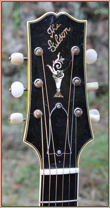
But in a spirit of good humour and expression of purely subjective personal opinions; what headstock logos do you love? Which ones do you loathe? Why? Personally, I love the banner era 'Gibson' script but, I dislike seeing it on brand new guitars. For me it is a signifier of an era and doesn't seem to 'fit' on new guitars. I'm not a fan of the Martin logo but it has some historical significance to impart. I love the old Fender logo (think slim 1950s Strat headstock), dislike the version on the big curly late 60s, early 70s Strat headstocks. Like the Taylor headstock logo (but not a fan of the guitars). I could go on and on... I love the old National 'shield'... love the old Rickenbacker spelled the original way, 'Rickenbacher' with the lightning bolts. Of course my personalbiasedfavourite is the windswept tree on my current commission with Dan Minard   For me it sums up the part of the world in which this guitar was created... it has movement and feeling and nature all wrapped up in a small circle. But that's just me, you may hate it...
__________________
Martin BC, Canada 
|
|
#2
08-23-2014, 12:10 PM
|
|||
|
|||
|
Martin, your windswept tree logo may be my new favorite.
|
|
#3
08-23-2014, 12:12 PM
|
|||
|
|||
|
My favorite is the Gibson script too, but I don't mind that it's used for new instruments. My least favorite is probably Blueridge. Martin logos are sort of generic looking, but are meaningful because of what they stand for.
|
|
#5
08-23-2014, 12:16 PM
|
||||
|
||||
|
I'm liking Alan Carruth's logo
__________________
Chuck 2012 Carruth 12-fret 000 in Pernambuco and Adi 2010 Poling Sierra in Cuban Mahogany and Lutz 2015 Posch 13-fret 00 in Indian Rosewood and Adi
|
|
#6
08-23-2014, 12:29 PM
|
|||
|
|||
|
Still a fan of the old Martin logo, here on my '40 D-18. Classic.
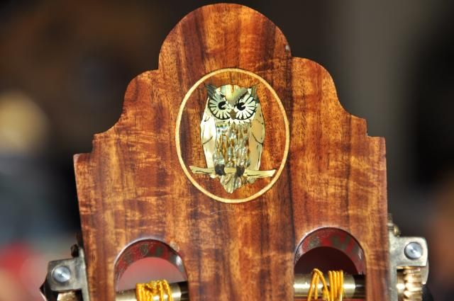
 1940 D-18 by f5joep, on Flickr 1940 D-18 by f5joep, on FlickrHow about this 2013 Arnold D-28 logo? Very cool! Love the accent red.  IMG_2759 by f5joep, on Flickr IMG_2759 by f5joep, on FlickrHere is an RS Guitarworks Old Friend Tele-style that I used to own. I love how RS incorporated their own take on the Tele headstock shape, as well as, developing a handsome logo: 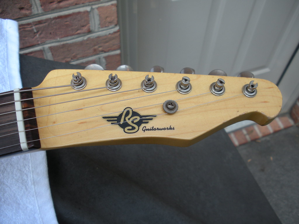 DSCN1540 by f5joep, on Flickr DSCN1540 by f5joep, on Flickr
|
|
#8
08-23-2014, 12:39 PM
|
|||
|
|||
|
Quote:
Quote:
 I kind of like Alembic's as well: 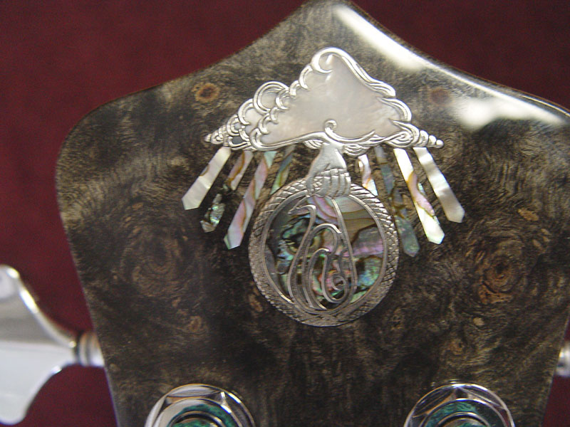 I know you don't play looks, but I think appearance is a big part of it. My AJ-60 caught my eye in the CL ad, so I was willing to travel quite a ways to take a look at it. Happens that I liked the sound as well, so I'm plenty happy with it. I also think that if you like the way it looks, you'll want to play it more.
|
|
#9
08-23-2014, 12:40 PM
|
|||
|
|||
|
I really like the logo on Bevan Frost's Big Hollow guitars. It's just a cross-section of a small branch (there's a cool story that goes with it but I can't remember the details), but it comes out looking like a beautiful full harvest moon. Sorry I couldn't find a close up of it.

|
|
#10
08-23-2014, 01:04 PM
|
|||
|
|||
|
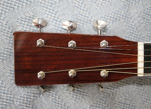
Never liked the raised gold foil Martin logos, too gaudy for my traditional taste, so I removed it from my HD-35 and refinished the headstock. I do like the no-logo aesthetics in general regardless of make, and now especially on my HD-35.
|
|
#11
08-23-2014, 01:26 PM
|
|||
|
|||
|
My all-time favorite headstock design remains the Lloyd Loar-era Gibson L-5:
 That said, I also admire the Santa Cruz Guitar Company's logo on this haircut headstock that shows some influence from that L-5: 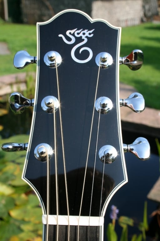 Another iconic logo/headstock combination with L-5 influence is this Olson guitar, built by the great Jim Olson:  This rear view of an Olson headstock is probably not from the same guitar, but it's so cool I decided to include it, anyway:  Full disclosure: I went through a period in my late teens and early twenties when I thought I was a Buddhist. In retrospect, I was a very Episcopalian sort of Buddhist, but that's neither here nor there. What it means in practical terms is that during that period I was building dulcimers and inlaying this same yin-yang symbol on the headstock of a view of them. My sister has one of those dulcimers I built back then, but I don't, and I don't have any photos of them to show. But you could say that I used the yin-yang symbol in pearl and abalone as my "logo" during that period. Wade Hampton Miller
|
|
#12
08-23-2014, 01:27 PM
|
|||
|
|||
|
I will almost certainly never play one, let alone own one, but there's something very classy about the Olson headstock symbol, IMO.
 (only talking about the "O", not the bird inlay, although that's nice too). I'm also a big fan of the Blazer & Henkes scroll: 
|
|
#13
08-23-2014, 01:46 PM
|
||||
|
||||
|
In general, I like most headstock logos. Rarely do they wow me, but some leave me scratching my head. Although I love my Voyage-Air guitar to pieces (truly an outstanding guitar!), I struggle to understand several things about the logo's aesthetics. I get having the full name for brand recognition (a la Breedlove's recent change in logo), but the text PLUS the VG symbol (which doesn't bother me as much) is too much. I would've preferred the full text but without a WordArt inspired arc. Even "air" wasn't capitalized in the earlier version, so I'm glad they updated it. In any event, I'm glad they didn't go with the acronym for for Voyage-Air Guitars. Could've put a damper on sales...
Harv, if you're reading this I still absolutely recommend Voyage-Air and won't be parting with mine!! At the end of the day it's just a headstock logo; the sound, looks (otherwise), playability, and portability more than compensate for any cosmetic preferences.
__________________
Larrivee LV-09BW Gibson J-15 Martin Custom D Rosewood Eastman E10SS Washburn Solo DeLuxe RSG100 Enya X4 Pro Carbon Fiber Guild Aristocrat M-75 Reverend Jetstream FM-HB Ibanez AS103 Ibanez AFJ95 Songbird Warbler Hammered Dulcimer
|
|
#14
08-23-2014, 06:35 PM
|
|||
|
|||
|
I am biased toward the Frogs:
Here is mine:  Here is a new design that they are doing with Glenn Carson:
__________________
Brandon "Life has no limit, if you're not afraid to get in it"-Mason Jennings
|
|
#15
08-23-2014, 06:54 PM
|
||||
|
||||
|
I love the new Avalon logo on my L32C

__________________
Jeff 2004 John Osthoff AS-C 1992 Taylor (DCSM)Dan Crary Signature Model 
|


