|
|
#16
 07-25-2014, 07:49 AM
|
|||
|
|||
|
Quote:
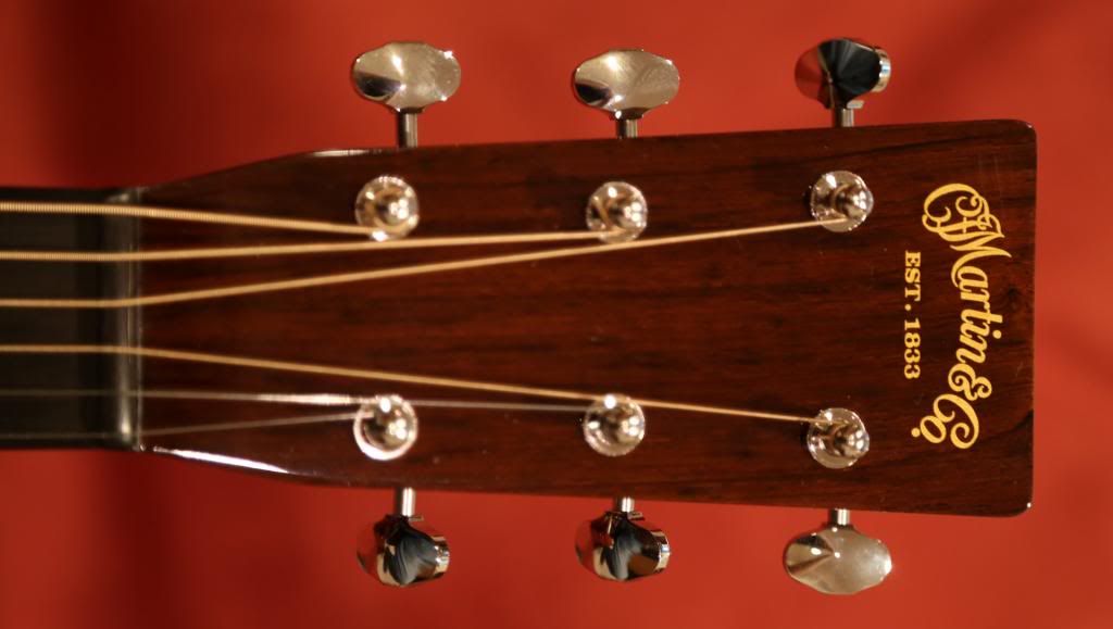
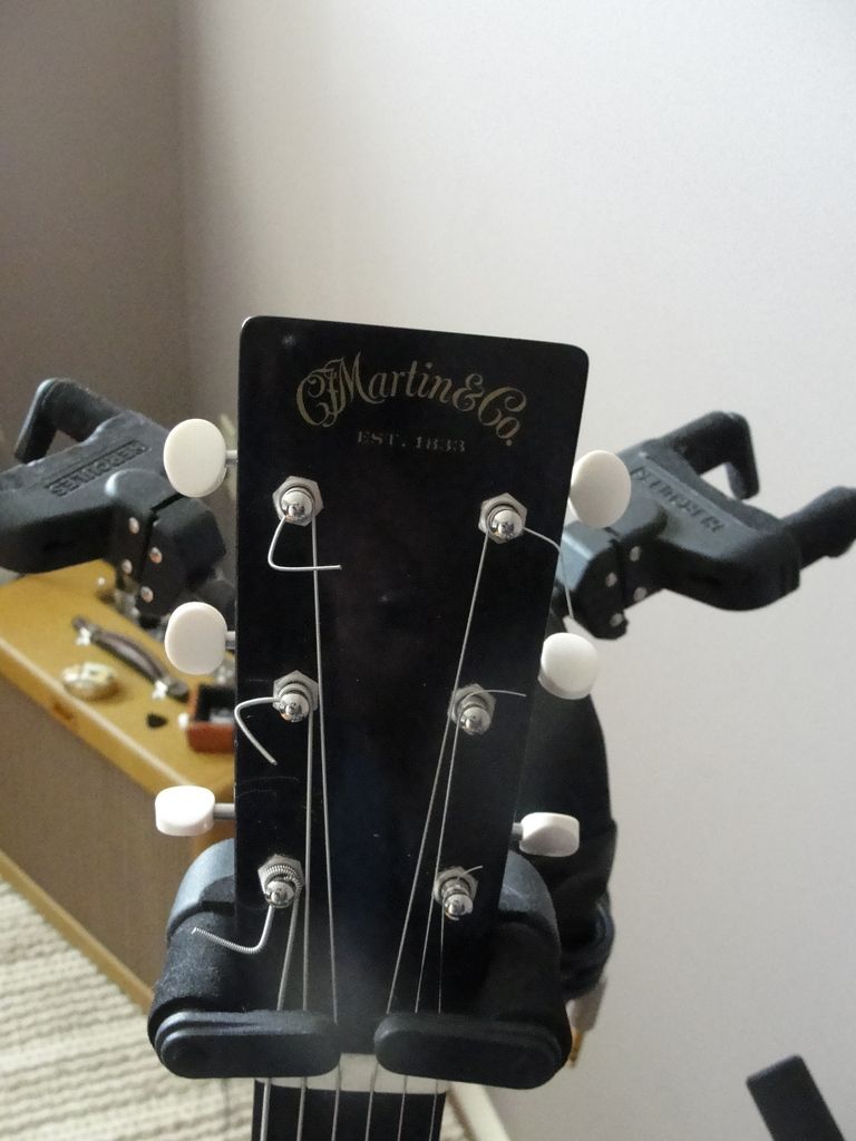
I recently did change it on my HD-35. The gold foil just looked too gaudy and plastic-like for my "traditional" tastes. Removed the foil and refinished sans any logo: 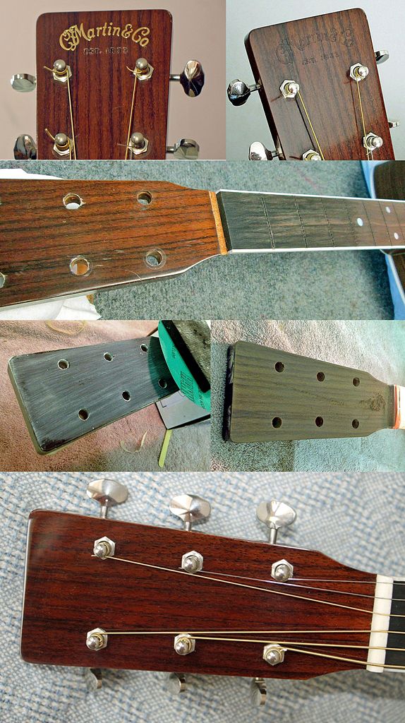 Removed the raccoon eyes too! 
|
|
#17
07-25-2014, 07:57 AM
|
|||
|
|||
|
Quote:
1934 Sillk screen logo  1934 Decal  
|
|
#18
07-25-2014, 08:00 AM
|
|||
|
|||
|
If it's anything like the PRS gold foil signatures on the PRS headstocks, they may have a tendency to rub off with polishing....
|
|
#19
07-25-2014, 08:07 AM
|
|||
|
|||
|
I like the more "traditional" logo a bit better, but the gold foil one never offended me at all - and let me say - I HATE bling.
That said, the gold foil logo never looked like bling to me - in my eyes it is a classy and subtle appointment. I have to say though, the decal on the Authentics might be the best looking one.
__________________
Looking for an excuse to "downsize", i.e. buy a new 00
|
|
#20
07-25-2014, 08:11 AM
|
|||
|
|||
|
Quote:
The Martin gold foils are under a coat of lacquer and are impervious to polishing. You can dig them out with an Exacto knife, but will leave a depression and raged edges where the lacquer has been broken. One of the periods on my HD-35 above flaked off, which gave me the motivation to remove them all. Would have left the headstock like that with the depressions, but couldn't buff out the edges of the remaining lacquer. So like Anne Boleyn's head, off they came.
|
|
#21
07-25-2014, 08:22 AM
|
|||
|
|||
|
I prefer the stamp on the back of the headstock. I already know it's a Martin.
 The front is clean:  The whole guitar - a Maury's Music custom 00-28VS 
__________________
Roger Several Martins, 2 Guilds, a couple of kits and a Tilton (ever heard of those?), some ukes and a 1920s Vega tenor banjo Neil deGrasse Tyson 'The good thing about science is that it's true whether or not you believe in it.'
|
|
#22
04-24-2017, 12:30 AM
|
|||
|
|||
|
I have to say, this is something that I've lost ZERO sleep worrying about. I like all of the Martin logos equally. I would certainly never refinish a headstock in order to get rid of one I disliked.
About the only Martin logo I'm not entirely enthused about is the one on the Martin CEO-8:   Martin CEO-8 Even then, I'd probably replace the pickguard but leave the headstock logo alone. It's deliberately not a very Martin-like headstock or company logo, either one, but that's kind of the point.... whm
|
|
#25
04-24-2017, 10:01 AM
|
|||
|
|||
|
The old decal was never a decal. It was silk screened.
__________________
"Vintage taste, reissue budget"
|
|
#26
04-24-2017, 10:25 AM
|
|||
|
|||
|
Quote:
__________________
Jim Dogs Welcome......People Tolerated!
|
|
#27
04-24-2017, 11:49 AM
|
||||
|
||||
|
The only thing I dislike more than the raised foil logo is the vertical abalone CF Martin logos of the 40 series. I would much prefer they be abalone script.
For everything else, Large Old Style script, or Script Golden Era.
__________________
Merrill | Martin | Collings | Gibson For Sale: 2023 Collings D2H 1 3/4 Nut, Adi Bracing, NTB -- $4100 shipped
|
|
#28
04-24-2017, 01:51 PM
|
|||
|
|||
|
Quote:
|